


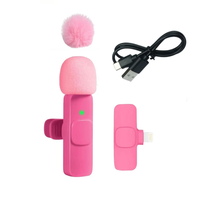
Description
SPECIFICATIONS
Brand Name: NONE
Choice: yes
High-concerned chemical: None
Material: Plastic
Origin: Mainland China
Type: Other


position: relative;
overflow: hidden;
}
.aplus-v2 .container-with-background-image {
width: 100%;
height: 100%;
background-repeat: no-repeat;
background-size: cover;
}.aplus-v2 .aplus-review-right-padding {
padding-right: 0.1rem;
}.aplus-v2 .aplus-review-right-padding {
padding-right: 0.1rem;
}.aplus-v2 .aplus-review-right-padding {
padding-right: 0.1rem;
}.aplus-v2 .aplus-review-right-padding {
padding-right: 0.1rem;
}.aplus-v2 .aplus-content-wrapper {
position: relative;
overflow: hidden;
}
.aplus-v2 .container-with-background-image {
width: 100%;
height: 100%;
background-repeat: no-repeat;
background-size: cover;
}.aplus-v2 .apm-brand-story-carousel-container {
position: relative;
}
.aplus-v2 .apm-brand-story-carousel-hero-container,
.aplus-v2 .apm-brand-story-carousel-hero-container > div {
position: absolute;
width: 100%;
}/*
Ensuring the carousel takes only the space it needs.
The sizes need to be set again on the absolutely positioned elements so they can take up space.
*/
.aplus-v2 .apm-brand-story-carousel-container,
.aplus-v2 .apm-brand-story-carousel-hero-container {
height: 625px;
width: 100%;
max-width: 1464px;
margin-left: auto;
margin-right: auto;
overflow: hidden;
}
.aplus-v2 .apm-brand-story-carousel-hero-container,
.aplus-v2 .apm-brand-story-carousel-hero-container > div {
height: 625px;
}.aplus-v2 .apm-brand-story-carousel.a-carousel-container {
padding: 0px;
}
/*
This centers the carousel vertically on top of the hero image container and after the logo area (125px).
Margin-top = (heroHeight - cardHeight - logoAreaHeight) / 2 + logoAreaHeight
*/
.aplus-v2 .apm-brand-story-carousel .a-carousel-row-inner {
margin-top: 149px;
}
/*
Cards need to have a width set, otherwise they default to 50px or so.
All cards must have the same width. The carousel will resize itself so all cards take the width of the largest card.
The left margin is for leaving a space between each card.
*/
.aplus-v2 .apm-brand-story-carousel .a-carousel-card {
width: 362px;
margin-left: 30px !important;
}
/* styling the navigation buttons so they are taller, flush with the sides, and have a clean white background */
.aplus-v2 .apm-brand-story-carousel .a-carousel-col.a-carousel-left,
.aplus-v2 .apm-brand-story-carousel .a-carousel-col.a-carousel-right {
padding: 0px;
}
.aplus-v2 .apm-brand-story-carousel .a-carousel-col.a-carousel-left .a-button-image,
.aplus-v2 .apm-brand-story-carousel .a-carousel-col.a-carousel-right .a-button-image {
border: none;
margin: 0px;
}
.aplus-v2 .apm-brand-story-carousel .a-carousel-col.a-carousel-left .a-button-image .a-button-inner,
.aplus-v2 .apm-brand-story-carousel .a-carousel-col.a-carousel-right .a-button-image .a-button-inner {
background: #fff;
padding: 20px 6px;
}
.aplus-v2 .apm-brand-story-carousel .a-carousel-col.a-carousel-left .a-button-image .a-button-inner {
border-radius: 0px 4px 4px 0px;
}
.aplus-v2 .apm-brand-story-carousel .a-carousel-col.a-carousel-right .a-button-image .a-button-inner {
border-radius: 4px 0px 0px 4px;
}
Return & Exchange Policy
Return & Exchange Policy
Welcome to Royal Orvix. Customer satisfaction is our priority. Please read our Return & Exchange Policy carefully before making a purchase.
Returns
We accept returns within 14 days of receiving your order.
To be eligible for a return:
- The item must be unused and in its original condition.
- The item must be returned in its original packaging.
- Proof of purchase or order number is required.
Non-Returnable Items
The following items cannot be returned:
- Personal care products
- Beauty products that have been opened or used
- Customized or personalized items
- Gift cards
- Items marked as final sale
Damaged or Incorrect Items
If you receive a damaged, defective, or incorrect item, please contact us within 48 hours of delivery.
Please provide:
- Your order number
- Clear photos of the product
- Photos of the packaging (if applicable)
We will review your request and arrange a replacement or refund if approved.
Exchanges
We only replace items if they are defective, damaged, or if the wrong item was sent.
To request an exchange, contact our support team with your order details and supporting photos.
Refunds
Once your returned item is received and inspected, we will notify you of the approval or rejection of your refund.
If approved:
- Refunds will be issued to the original payment method.
- Processing times may vary depending on your payment provider.
- It may take several business days for the refund to appear in your account.
Order Cancellation
Orders can only be canceled within 12 hours of purchase.
Once an order has been processed or shipped, cancellation may no longer be possible.
Shipping Costs
- Original shipping charges are non-refundable.
- Customers may be responsible for return shipping costs unless the return is due to our error or a defective product.
Contact Us
For any return, exchange, or refund requests, please contact us:
Royal Orvix Customer Support
Email: support@royalorvix.com
Website: www.royalorvix.com
Response Time: 24–48 Business Hours
Shipping Information
Shipping Information
At Royal Orvix, we strive to deliver your orders as quickly and efficiently as possible.
Order Processing
- Orders are typically processed within 1–2 business days.
- Orders are processed Monday through Friday, excluding public holidays.
- Once your order has been shipped, you will receive a tracking number via email.
Estimated Delivery Times
USA Warehouse Products
Products shipped from our USA warehouse are usually delivered within:
2–3 Business Days
International Warehouse Products
Products shipped from our international fulfillment partners are usually delivered within:
3–7 Business Days
Please note that delivery times are estimates and may vary depending on your location, weather conditions, carrier delays, customs processing, or peak shopping seasons.
Tracking Your Order
Once your order has been dispatched, you will receive tracking information that allows you to monitor your shipment's progress.
Shipping Delays
While we work hard to ensure timely deliveries, occasional delays may occur due to:
- High order volumes
- Carrier issues
- Customs inspections
- Weather disruptions
- Public holidays
In such cases, we appreciate your patience and understanding.
Incorrect Shipping Information
Customers are responsible for providing accurate shipping details at checkout.
Royal Orvix is not responsible for delays or failed deliveries resulting from incorrect addresses provided by customers.
Lost Packages
If your package appears to be lost in transit, please contact our support team. We will work with the shipping carrier to investigate and assist in resolving the issue.
Contact Us
For shipping-related questions, please contact:
Royal Orvix Customer Support
Email: support@royalorvix.com
Website: www.royalorvix.com
Response Time: 24–48 Business Hours